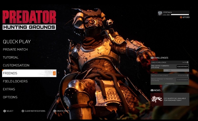
@Courier @OldKingHamlet Can you please ask whoever is responsible for these beautiful works of art to continue doing what they’re doing, create even more and give us an ability to view them without any of the menu options? I do miss the original menu screen, perhaps add that back into the rotation? But I know many of us really appreciate the new aesthetic, and want even more dynamic scenes like this as well as the ability to see them with none of the menu clutter.
More of these...
Hmmm now that I think about it, the new menu seems reminiscent of the Dutch Vs Pred scene in the first movie which could be a tease for that datamined last man standing mode. Either that or I forgot to take off my tinfoil hat. 🤔
You could be on to something, it could be an indication of what’s going on in their minds at the office…yes, my tinfoil hat has been tingling too😈 We will never truly know until Illfonic speak to us directly, and quit with ambiguous tweets/responses…
Illfonic got the riddler working for them with all these teases and clues.
Even a basic Photo Mode would be welcome, one where we could go into a solo Private Match and take cool images of our Predators or FT. Or where we select our default Pred and FT member, and we can choose from a range of dynamic poses and then get a moving screen like the one we have in the menus now…? These images are just too gorgeous to go to waste.
I would eat a horses testicle for a ‘clear menu items’ button and another one with all our loadouts featured in an either Predator only shot…or FT only shot.
But you can’t have it all in one bite. It be too much for the fanbase. The taste would be Overload!

Agreed 😏
My heart broke…seeing those beautiful, happy people enjoying life…if only we could go back to those times.


