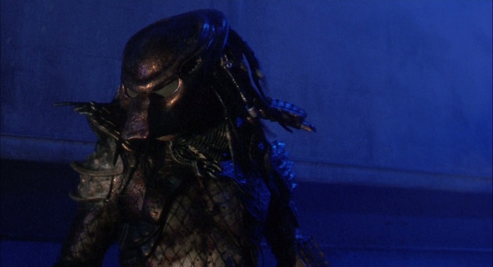
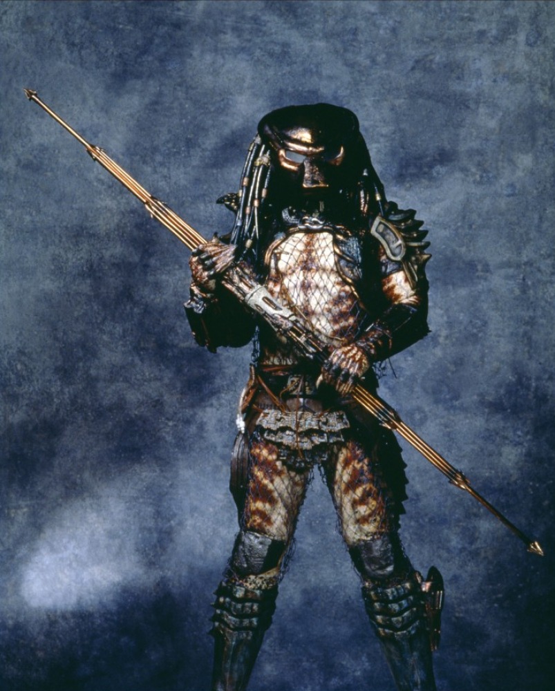
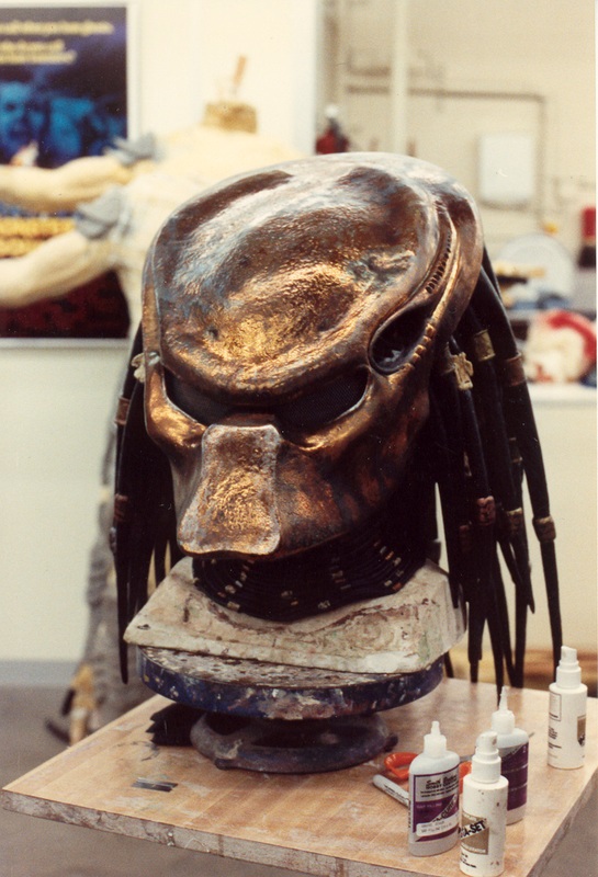
Is it just me or does City Hunter’s mask look too grey in the official photo:
I hope its just in that picture and it looks better in the actual game. It should be more brown/bronze:

Is it just me or does City Hunter’s mask look too grey in the official photo:
I hope its just in that picture and it looks better in the actual game. It should be more brown/bronze:
Maybe just some light effect.
I’m more curious about his skin color, he looks more orange while movie version is more brownish.
There is clearly an odd orangish lighting, wait until he’s in game before making these posts
Its called sunlight. Try to get some!

I keep seeing a lot of posts nitpicking the accuracy of City Hunter, and while that’s all fine, I’d say to wait until he’s in the game to really see if the inaccuracies stay or not.
the lighting on the roadmap is very extreme, nearly cartoonish. He will look very different ingame.
it also depends on the map very much. Derailed has the best looking lighting in my opinion, while overgrowth with that yellow/green light makes your predator look totally off.
Its just harsh lighting. Nothing photoshoped about it…The light is very close to its body in order to create dramatic highlights at the top of his helmet, left arm and left breast armour…the warm light on his right breast plate is white too. Meaning it was closer to the object.
The intended purpose of this type of lighting is to make things pop. Its very intentional and unnatural like a studio photoshoot. Not intended to convey mood only intended to show form…mainly.
Although cartoonish, you’re right actually. Comic book colourists/illustrators opt to do this so that colors pop out on the page with a full range of values.
Back lighting and side lighting essential for this IMHO.

Thanks for the lesson in media presentation 😉