I feel the need to communicate my frustrations at the map currently in the game.
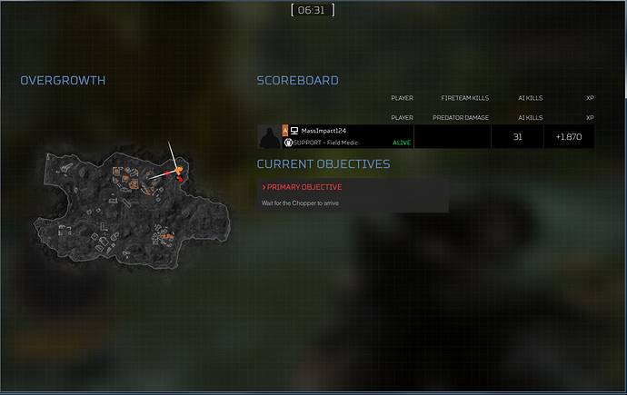
It is in dire need of reformating simply because the map’s information is hard to read. Icons are so small that it renders important placements of ammo crates as a blur.
Take a look at what it is now: Questino: How am i suppose to find what I need?
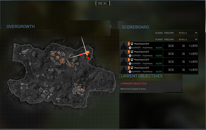
The map currently is about 1/3 if the screen. 1/3?!!! Are you kidding me? It should be at least 1/2. This kind of formatting screams incompetence at the college level!
Here is a reformatting based on the fact that Predator damage information could be reformated, and AI kills too, as well as squeezing out the empty space in the name fields. Scaling the map to meet 1/2 the screen is a nobrainer for all four maps.


