Platform: PC
Shaking lines
Localisation: Russian
Rezolution: 1920x1080
There are lines in the in-match menu that start shaking when the game timer starts. It looks like long lines don’t fit in the given block and this is causing a conflict.
Main menu lines:
- Keyboard and mouse settings
- Keyboard and mouse binding
Pred menu lines:
-
Jump/ Leap/ Interaction
– Rebinding key: Jump/ Leap/ Interaction -
Leap/ Change branch
– Rebinding key: Leap/ Change branch
"Change branch" key mapping
Some key binding change the interface key display for the tree jump action.
For example, my tree jump key is Left Control. When none of the keys from the list below are bind, the interface displays a hint to climb the tree as Left Control. When I set the keys in the list below to bind Space Bar, the display of the climbing UI changes to Space Bar. The Predator is still climbing the Left Control, but the interface shows a Space Bar.
Buggy bindings:
- Jump / Interaction
- Jump / Leap / Interaction
- Cloak / Interaction
Fake Interaction keys
Predator key binding has a two Interaction item, which doesn’t work:
- Healing / Interaction
- Surrender / Interaction
I disabled all “Interaction” item and left these two one by one. It doesn’t work for pigs, trees and over.
These lines need correction.
"Use gear 3" hotkey works incorrectly
Third slot “Use gear 3” hotkey works as “Choose gear” for all items except the syringe. Marine just pulls out the item and holds it in his hands. You need to click the mouse to throw a grenade or support item.
Frag grenade – if you don’t touch the mouse, marine still throws a grenade, but after holding for several seconds in a swing.
EMP mine holding
After throwing EMP mine with any hotkey, marine holds it in his hands and doesn’t remove it until you change weapons. This is very uncomfortable in the heat of battle.
Upd 12.30.2020
Self-destruct button bug
My key binding:
Surreder = F
Self-destruct = F
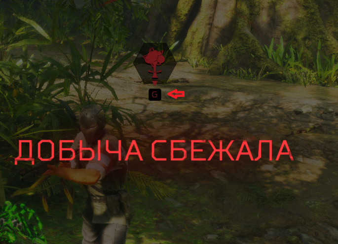
But when the predator is down, an explosion icon appears with an “E” under it. Pressing “E” does nothing, the explosion is triggered by the “F” key, as I have assigned.
On “E” I have only second wind healing and thermal vision as pred. And Interaction as FT.
P.s.: I checked. This FT Interaction binding is causing this bug. I binded his Interaction to G and the letter under the self-destruct icon became G.

UI QoL
The scrollbar is difficult to grab with the mouse, make at least the invisible part wider so that you can intuitively grab it easily without annoyance and diligent aiming. And (or) increase the sensitivity of the mouse wheel, with adequate scrolling in over games, here the list barely moves.
"Remove" button
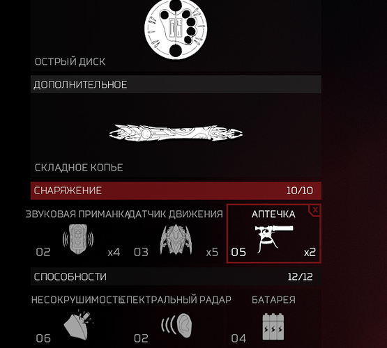
The list of ft and predator perks has a “Remove” button. Add this one for weapons too. For example, I want to remove all weapons and play a classic predator with only a plasma custer and wristle blades.
I would also suggest making the removal gears easier and faster. Often, to put a different set of perks, you need to go to the first perk, click remove, click back, go to the second perk, click remove, click back, go to the third perk, and only then start setting a new loadout or choose a heavy perk that doesn’t fit in points.
Why not make buttons with a cross in the corners of the frames? You just do three clicks and clear all slots without going to different screens.
In addition, the weapon’s side menu has a “Select” button. Why is it needed if clicking on the weapon icon does the same thing and brings us to the same “Select” menu? Perhaps it would be logical to replace this with the “Remove” button, as a variant of cross button.
UI lacks smoothness
UI has big white-gray rectangles that jump very sharply along the lines when we move the mouse cursor over the menu. Zero-latency highlighting is good for small lines, but not for big blocks. It looks jerky and harsh with this. Add duration for menu highlighting, maybe 0.2-0.5s, to make it look smoother.
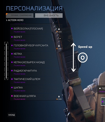
This jerking is also noticeable in the entrance to the customization. After clicking the “Appearance” button, the mouse cursor immediately stands on some element of the appearance, which changes the display of the character model. You need to move away the cursor to see your normal character.
Key Bind List
The keybind list is terribly disorganized and jumbled up. Action keys of the same theme are scattered throughout the list, main actions, the most frequently used, secondary, movement, attack… The main WASD control keys are at the very bottom in the last place, when they should be in the first one along with shooting.
Of course, you can customize keys despite this, but navigating the list is sooooo hard.
Sensitivity settings
Aim
FT and Predator have the same aim sensitivity scale, but Predator’s aim moves slightly slower than FT one. I think it won’t be superfluous to separate the aim settings for both of them.
SmartDisc
The sensitivity of the smart disc is tied to the sensitivity of the main camera, but 2-3 times less than it. And this cannot be changed in any way now. Increasing the disc sensitivity makes the main camera crazy. The disc should be separated from the main cam and get its own sens scale.
The second thing about the disc is its handling. At the moment it turns while you move your mouse. It flies forward as soon as the mouse stops moving. This means that to make a big U-turn, you have to constantly move the mouse across half of the table or jerk it on the mouse pad. Combined with the low sensitivity, this makes the disc almost unhandleable now and capable of flying mostly in a straight line with small turns.
In addition to adding a separate scale for sensitivity, it would be nice to add the mechanic of turn from the zero coordinate. You swing and throw the disc, the position in which the mouse is located is taken as zero. As long as you don’t move the mouse, the disc flies straight. When you move the mouse 2cm to the right and hold it there, the disc keeps turning 50% to the right. When you move the mouse 4cm and hold it there, the disc keeps turning 100%. When you return the mouse to the starting position, the disc flies straight.
Like a gamepad stick. You keep the stick to the right, the disc keeps turning to the right. The disc doesn’t stop turning once the player has finished moving the stick. The player doesn’t need to jerk the stick to the right like crazy to keep the disc turning.
Sound balance
The effects volume scale is responsible for the volume of the environment, forest sounds and shooting, explosions at the same time. However, the explosions from plasma weapons are too loud compared to the sounds of other weapons and firearms ft. It would be good to make it quieter.
And the grunt of the boars seems to be too quiet on the normal volume for shooting effects and explosions. I never hear them, even in a thermal vision, if they are somewhere behind a tree or in the bushes. Seeing on the stream, I was surprised that they can grunt loudly. However, their death screeches are working correctly.
How about dividing the volume of the environment, forest, animals, echoes, from combat sounds, shooting, explosions? This will allow to adjust the sound of the forest for a more immersive experience.
Upd 11.17.2021
OWLF tapes orderliness
In Russian localization, after adding new tapes, its order was messed up.


